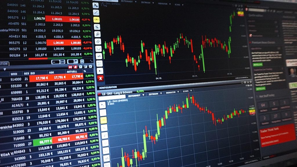
How to read a crypto chart: simple guide for beginners
New to crypto charts? This quick guide shows which chart to pick (line vs candlesticks), how to read a candle’s body and wicks, and the few patterns that actually help. You’ll also learn to stack timeframes – daily for trend, 4H for setup, 15m for entry – plus a tiny checklist to avoid common mistakes. No jargon, just practical steps.
Types of crypto charts and how to use them
Most beginners start with line charts because they’re simple: one price per candle (usually the close). They’re great for spotting big trends and support/resistance zones without noise. But they hide intraday battles.
Candlestick charts show the full story of each period: open, high, low, close. Long wicks hint at rejection, small bodies mean indecision and a series of higher highs/lows signals momentum. For day‑to‑day analysis, candles are the default.
Bar (OHLC) charts carry the same data as candles but with thinner visuals. Some traders prefer them for a cleaner look on crowded screens.
Heikin‑Ashi smooths the price by averaging candles. It filters chop so trends stand out, but it lags during reversals – use for context, confirm with regular candles before acting.
Depth charts aren’t price history at all; they show current bids/asks. Walls can hint at near‑term supply/demand, though spoofing exists. Treat them as short‑term context, not a trading signal.
How to choose the right view:
- Use line charts to sketch the “big picture” trend and major levels.
- Switch to candles for entries/exits; read wick length and body placement near your levels.
- If the market is choppy, glance at Heikin‑Ashi to judge whether a move actually trends.
- Peek at depth only around breakouts or into key levels to gauge liquidity.
Quick setup tips: pick a timeframe that matches your availability (e.g., 1D for investors, 1H/15m for active traders), keep your chart uncluttered (price + volume first), and save templates so switching markets is one click. For anyone reading crypto charts for the first time, start simple, make one change at a time, and practice on historical data before risking money. Before funding any exchange account, do a quick reputational check – for example, see Kraken reviews to understand what to verify.
How to Read a Candlestick Chart: The Basics
A candlestick packs a mini‑story about the battle between buyers and sellers. Start with the body: it shows where price opened and where it closed for that time period. Add the wicks (shadows): they’re the highest and lowest trades, the auctions at the edges. Color finishes the picture – green (or white) means price closed above the open (buyers won that interval), red (or black) means sellers did.
If you’re learning how to read crypto charts for beginners, start by focusing on the candle’s shape rather than its name. A long upper wick says buyers tried to push higher but were pushed back – sellers showed up. A long lower wick suggests buyers defended levels after a dip. Now place that context on your chart: are you near a prior support or resistance zone, or in the middle of nowhere?
Three simple patterns go a long way when they appear at good locations. A “Hammer” after a drop (tiny body, long lower wick) can mark defense at support; a “Shooting star” after a rally (tiny body, long upper wick) can flag supply near resistance. An “Engulfing candle” – where the body fully wraps the prior one – often signals a momentum shift. A “Doji” (open ≈ close) is indecision; don’t act until the next candle confirms direction.
Use volume as a lie detector. A pattern with above‑average volume is more convincing than one on quiet trade. Draw support/resistance from clusters of candle closes, not single spikes – levels with more tests usually matter more.
Tiny drill: open a 4‑hour chart, find two hammers near support, and check if volume expanded.
Don’t do this: chasing every low‑timeframe pattern against the daily trend is a fast way to get chopped; zoom out first.
Understanding Chart Timeframes and Why They Matter
If you’re learning how to read bitcoin charts, think in layers. The daily (1D) sets the story – trend and key levels. The 4‑hour (4H) frames the scene – pullbacks, ranges, and breakouts forming around those levels. The 15‑minute/5‑minute times your entry and manages the trade – trigger, stop, and take‑profit.
Start at 1D. Mark higher highs/lows for an uptrend, lower highs/lows for a downtrend, or horizontal clusters for chop. Draw levels from clusters of closes, not single spikes. This top‑down map is your bias.
Drop to 4H. Ask one question: how might the price reach those 1D levels – drifting, consolidating, or exploding? Pullbacks into support, failed breaks, or fresh ranges tell you whether to plan breakout or mean‑reversion ideas. Volume that expands near levels adds conviction.
Only now visit 15m/5m. Define the actual trigger (break and hold above a line, or a quick rejection), place the stop where the idea is invalid, and size the position so a losing trade is just a paper cut. Alerts at levels save you from staring at screens.
Common mistakes come from mixing stories: taking a 5m long into a clearly bearish daily, or switching timeframes mid‑trade to justify hope. Guardrails help – pre‑define invalidation on the higher TF, set alerts, and risk a fixed amount per trade.
Mini exercise: open BTC 1D→4H→15m and write one sentence per timeframe – story, setup, entry.
Don’t do this: stacking indicators across five timeframes. Clean levels and volume beat clutter.

