Designers, developers, and content managers all know the struggle. You have a solid product, clean code, and great copy. But the visuals? Missing. You face three bad options: expensive illustrators, risky DIY attempts, or generic stock graphics that scream “template.”
Design resources always balance coherence against convenience. Can a library of pre-made assets support a real brand system, or must you go fully custom to avoid looking generic?
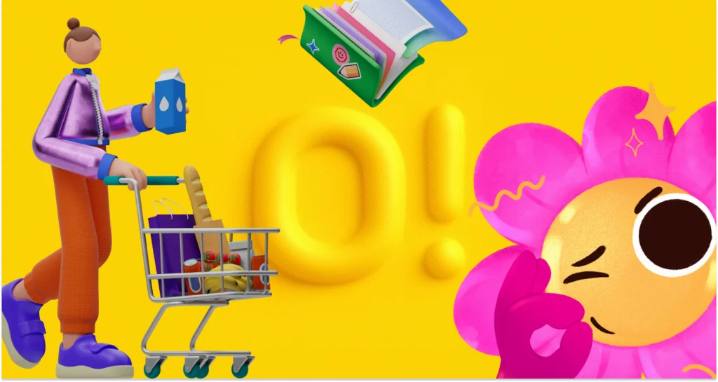
Ouch by Icons8 tackles this by ignoring individual images. It focuses on “styles.” Instead of a random grab bag of disparate vectors, you get massive collections-over 101 styles ranging from 3D to flat vector-that share the same DNA.
Establishing Visual Consistency in UI Design
Custom illustration implies consistency. Empty states, onboarding screens, and error messages must feel like they belong to the same universe. Mixing stock assets usually creates a “Frankenstein” effect. One character has outlines, another doesn’t. Colors clash. It looks messy.
Ouch solves this with volume. A UI designer working on a fintech app doesn’t just need “money.” They need a transfer success state, a processing wait screen, and a 404 error page.
Here is a typical workflow. Pick a style matching your brand voice-perhaps clean and minimal for banking, or 3D and playful for a gamified savings tool. With over 23,000 technology illustrations and 28,000 business illustrations available, you can map an entire user flow without switching styles.
Paid plans unlock SVG access. Download the vector, re-key the colors, and match specific hex codes. Stripping default colors for a brand palette tips the scale from “stock” to “brand asset.” The result looks intentional, not borrowed.
Content Marketing and the Need for Speed
Marketing teams fight a different battle: velocity. A social media manager or blog editor can’t wait weeks for a custom header. They need quality visuals now to break up text or stop the scroll.
Picture a newsletter about remote work. Stock photos of people shaking hands feel dated and disingenuous. Ouch’s 3D styles or textured vectors work better.
Enter the Mega Creator tool. Don’t just download a static PNG. Combine elements. Writing an article about “burnout”? Take a character from a compatible style, swap the background for a home office, and adjust elements to tell that story. This modularity-breaking graphics into searchable, layered objects-enables storytelling that standard stock sites block.
Some creators experiment with ai clipart for unique visuals. But Ouch offers aesthetic reliability. You know exactly how 3D lighting looks across ten blog posts. That ensures the newsletter maintains a recognizable visual identity over time.
A Friday Afternoon Deadline
Let’s look at a real workday. It’s Friday. A freelance developer needs to ship a startup landing page by 5 PM.
Client copy and logos are ready. Imagery is not. The developer opens the Ouch library, filters for “Web Elements” and “Startup,” and spots a style called “Business 3D.” It fits the modern, tech-forward vibe.
First, the hero image. They find a 3D composition of a team working around a dashboard. Close, but the client sells mobile apps, not desktop software. Using customization features, the developer swaps the desktop monitor element for a mobile phone within the scene.
Next, the “Features” section needs three icons. Staying within the same 3D style family ensures lighting and textures match the hero image. A rocket for speed. A shield for security. A gear for settings.
Finally, a “Contact Us” graphic. A character holding an envelope completes the set. With the deadline looming, they use Pichon (the desktop app) to drag high-res PNGs directly into the code editor. Total time: 45 minutes. The client receives a polished, visually consistent page before the weekend.
Comparing Ouch to the Alternatives
Ouch occupies a specific middle ground in a crowded market.
Vs. Undraw: Undraw is the open-source standard. Free and decent, but ubiquitous. Using it signals “generic startup.” Ouch offers distinct styles-surrealism, sketchy, 3D-helping brands differentiate better than standard flat tech art.
Vs. Freepik: Freepik has a massive library, but quality varies. You might find one great image and zero matching assets for other use cases. Ouch builds collections as systems. Like a style? You’ll find hundreds of matching assets.
Vs. Custom Illustration: Custom work remains the gold standard. Need your CEO riding a dragon? Ouch can’t help. But custom work costs too much for MVP launches or daily blogs. Ouch gets you 80% of the way there for a fraction of the price.
Limitations and When This Tool Is Not the Best Choice
Flexibility has limits. Ouch isn’t always the right fit.
Brands relying on specific mascots doing niche actions will hit a wall. You can swap parts, but you can’t invent poses. A dog fixing a nuclear reactor won’t exist in the component library.
Also, the library is finite. Niche industries might find “Business” or “Technology” metaphors too broad. Designing for complex surgery or heavy machinery requires technical accuracy stock illustrations lack.
One catch: the free tier requires link attribution. Professional projects-client work or commercial apps-rarely tolerate footer links to Icons8. Serious use requires a paid plan.
Practical Tips for Getting the Most Out of the Library
Bridging the gap between stock and custom takes effort.
Don’t mix dimensions: Never put 3D illustrations next to flat 2D vector art. It breaks immersion instantly. Pick a lane.
Recolor everything: Even if default colors look nice, change at least one primary color to your brand’s accent. This claims ownership. For SVGs, clean up layers to keep code lightweight.
Use Lottie animations: Static images feel dead on mobile apps. Ouch provides Lottie JSON and Rive formats for many styles. Replace a static checkmark with an animated one. It adds polish users associate with high budgets.
Leverage 3D Models: Proficient in 3D? Download FBX formats. Re-light or re-texture models in Blender or Cinema 4D. You get total control without the modeling phase.
You don’t always need a dedicated illustrator for a dedicated look. Treat illustrations as design systems, not decoration. It’s a viable path to build coherent brands at speed.

